
Project Overview
Problem
A key aspect of a website's success is its navigation design, which determines how easily users can move through the site. Good navigation keeps users happy and engaged, while poor navigation can lead to frustration and decreased satisfaction. There are two main types of navigation designs widely used today: search functions and drop-down menus. Despite their widespread use, there's limited research comparing the effectiveness of these two navigation designs in terms of user performance and satisfaction.
Solution
A/B testing the two navigation designs by designing and prototyping a life-like e-commerce website featuring both search function and drop-down menus, testing them with real users, and measuring user satisfaction based on the dependent variable “time to complete tasks”
Results and Impact
Underscoring the need for meticulous design and user testing to create effective and user-friendly website navigation.
My Role
UX Research, UI Design, Prototyping, User Testing
Project Details
During the early stages of my master's research project, I was tasked with selecting a topic that piqued my interest and filled a noticeable gap in existing research. This challenge was exciting and daunting, as it required a keen eye for identifying areas underexplored or overlooked by previous studies.
As I looked into different aspects of web design, I noticed that navigation design was often discussed but not thoroughly compared. Specifically, there wasn't much research comparing search functions with drop-down menus. Most studies focused on just one method or discussed navigation in general, without really diving into how these two methods stack up against each other. I realized that exploring the direct comparison between search functions and drop-down menus could yield valuable insights. Search functions and drop-down menus are among the most common navigation tools, yet they cater to different user behaviours and preferences. A search function allows for a user-centred approach, where individuals can type in keywords to find specific content quickly. In contrast, drop-down menus provide an exploratory approach, guiding users through a structured path of choices.
By conducting this research, I aimed to bridge the knowledge gap and offer practical recommendations for improving website navigation design. This project was compelling because it combined theoretical research with real-world applications, ultimately aiming to enhance the user experience on websites that millions of people interact with daily.
Research Question
As I reviewed existing studies, I found that while there's a lot of research on website navigation, some areas remain unexplored. For example, previous studies have shown that navigation design affects user performance and satisfaction, but they haven't fully examined the combined effects of factors like cognitive style (how people think and process information) and task/search complexity.
Given these gaps, my study focused on three main questions:
- How does navigation design affect user performance when searching for information on a website?
- How does navigation design impact user satisfaction when searching for information on a website?
- Do factors like the user's cognitive style, website familiarity, or task complexity influence the effect of navigation design on user performance and satisfaction?
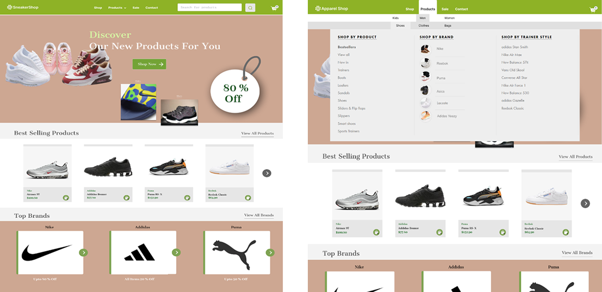
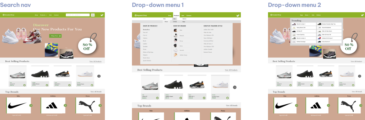
Creating the test
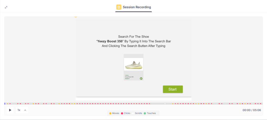
To thoroughly investigate how different navigation designs impact user performance and satisfaction, I developed a comprehensive testing process using Figma and ProtoPie. These tools allowed me to create realistic prototypes of both navigation designs and simulate a lifelike website experience.
The wireframes included:
- Search Function: A prominent search bar at the top of the page where users could type in keywords to find specific products.
- Drop-Down Menus: Two versions of drop-down menus. The first version had a more comprehensive list of categories and subcategories, requiring users to sift through more information. The second version was more streamlined, with fewer categories and a simpler structure.
Conducting The Test
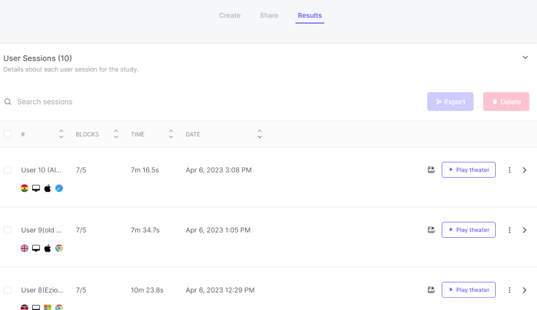
With the prototypes ready, I recruited ten participants (five males and five females) aged 21 to 35, all of whom had at least an undergraduate degree and high computer literacy. The small sample size was chosen to provide initial insights into user behaviour, with plans for future studies to expand the sample for more generalized results.
Participants were asked to complete a series of separate tasks of finding and selecting different items on the e-commerce website prototype using both the search function and the drop-down menus :
1. They used the search function to locate the different products.
2. They navigated through the detailed drop-down menu to find the products.
3. They used the simplified drop-down menu to locate other products.
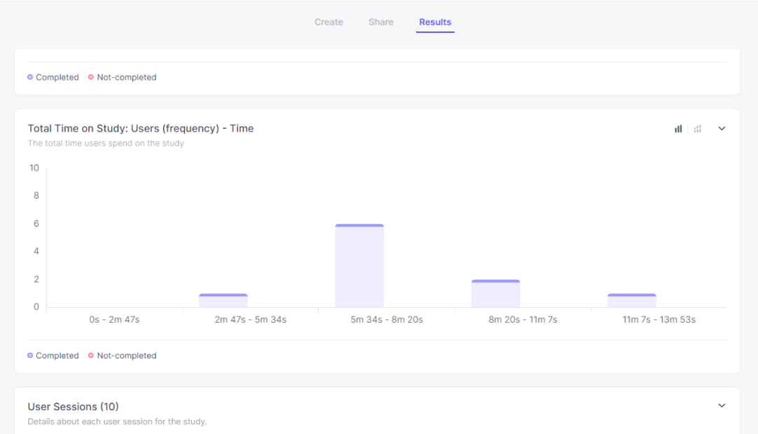
Tracking The Results
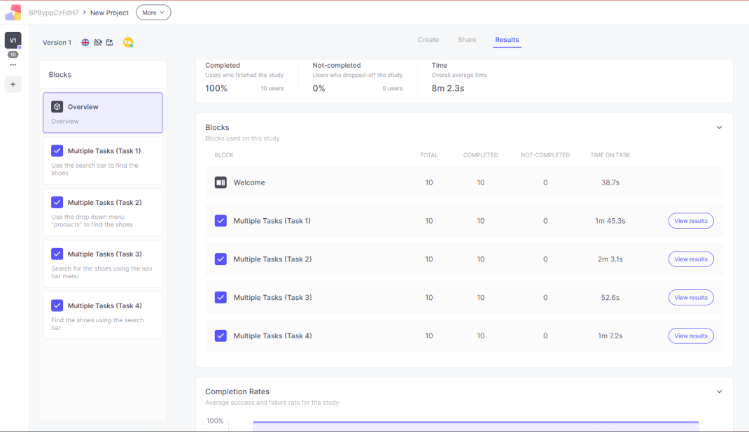
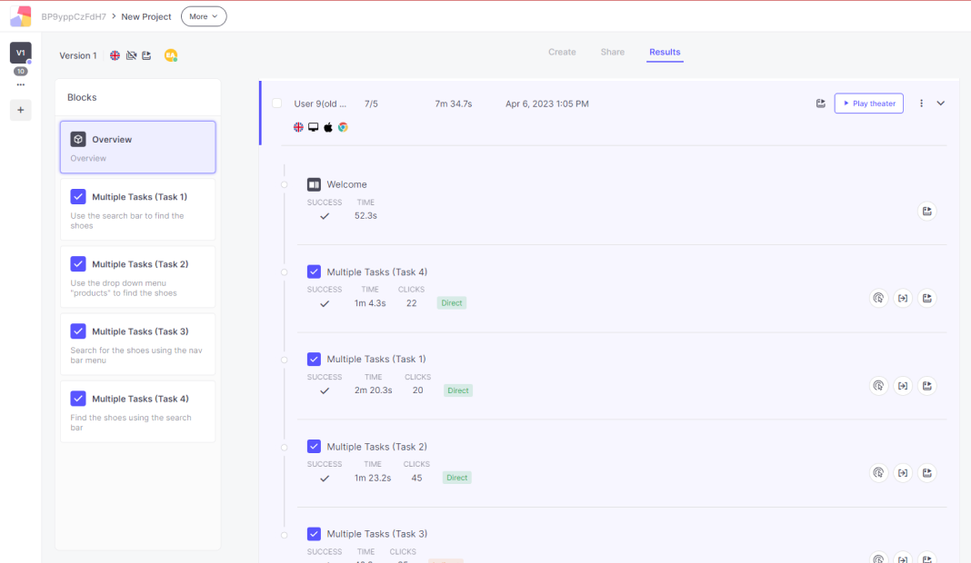
To gather and analyze the test results, I utilized Useberry, a user-testing web application. Useberry provided detailed insights into user interactions with the prototypes, offering real, quantifiable, and measurable data to assess user performance and satisfaction.
Time Tracking: Useberry allowed me to track the amount of time it took each participant to complete individual tasks using each navigation option as well as the total time to complete all tasks. This data was crucial in comparing the efficiency of the search function versus the drop-down menus.
Time Tracking: Useberry allowed me to track the amount of time it took each participant to complete individual tasks using each navigation option as well as the total time to complete all tasks. This data was crucial in comparing the efficiency of the search function versus the drop-down menus.
Click Points and User Paths: Useberry recorded the click points users made throughout the test, highlighting where they clicked and the paths they took to find items. This helped identify any points where users got stuck or had difficulty navigating, providing insights into the usability of each design.
Heatmaps and User Journeys: The application generated heatmaps and user journey maps, visually representing the areas where users spent the most time and their navigation flow. This information was invaluable in understanding user behaviour and identifying any friction points in the navigation designs.
Analyzing The Results
Normality Test
First, I checked if the data gotten from useberry during the testing phase was normally distributed, which it was. This allowed me to use certain statistical tests to analyze the data accurately.
ANOVA And Post-Hoc Analysis
I used ANOVA and Tukey HSD tests to compare user performance across navigation designs. The results showed that:
- Search Bar: Users performed well but not significantly better than with drop-down menus.
- Detailed Drop-Down Menu: Users took more time and had lower satisfaction due to the complexity and amount of information.
- Simplified Drop-Down Menu: Users performed better with fewer categories to sift through, showing that a simpler design can be more effective.
Initial Hypotheses Implications After Result Analysis
After further testing the results, the null hypothesis had to be rejected as the user performance showed a significant disparity among the different navigation designs. Nevertheless, the divergence wasn’t aligned with the initially hypothesized position. The significant disparity in user satisfaction lay within the two drop-down menu designs rather than between the search method and either drop-down menu design.
In light of this, neither of the alternative hypotheses could be accepted. Neither the search method nor the drop-down menu designs significantly outperformed each other. Intriguingly, the noticeable variance in user performance was confined within the drop-down menu designs themselves, with drop-down menu 1 outperforming drop-down menu 2.
Given these observations, it can be inferred that subtle differences within drop-down menu designs can significantly sway user performance. This underscores the significance of meticulous design considerations, even within particular types of navigation mechanisms.
Outcomes And What I Learned
Key Findings
A significant difference in user performance was found between the two drop-down menu designs. Users performed better with a simpler drop-down menu that had less information, while a more detailed menu caused delays and reduced satisfaction.
There was no significant difference in user satisfaction between the search bar and the drop-down menus. Both had their advantages and drawbacks.
There was no significant difference in user satisfaction between the search bar and the drop-down menus. Both had their advantages and drawbacks.
UX Insights
- Attention to Detail: The qualitative data obtained from users after testing highlighted the importance of small design elements like layout, size, labelling, and the amount of information presented. These details significantly impacted user experience and performance.
- Simplicity is Key: Simplified navigation options generally lead to better user performance and satisfaction.
- Simplicity is Key: Simplified navigation options generally lead to better user performance and satisfaction.
Limitations And Conclusion
The project had a relatively small sample size, making it challenging to generalize the findings to a larger population. Future research should include more participants for more robust conclusions.
Factors like website content complexity, users' familiarity with the site and time to complete the project were limiting factors I faced when undertaking the project.
While the initial hypotheses were not supported, the findings offer valuable insights into navigation design's impact on user performance. This knowledge can guide UX designers in creating more efficient and user-friendly navigation tools, ultimately enhancing user satisfaction and performance through careful and tested design.